In this world, it doesn't matter what you do, or how much love you put into things, there will always be someone to criticize it. Sometimes, even people from within and directly related to the matter. Yesterday, the WTA announced a remodeling of its brand, unveiling its new logo, colors, and website design. 'A new stage,' according to the commercials. But for Kristina Mladenovic, currently outside the top 200, it doesn't seem to have thrilled her.
"I wonder how did this come to you? And who approves it? Green and white? Without any tennis details? What does it represent? The previous logo was much better," expressed the Frenchwoman on her social media, strongly criticizing her own circuit. What do you think? Did you prefer the previous design or the current one?
Wondering how you can come up with this? 🤔 and who approves?
— Kristina Mladenovic (@KikiMladenovic) February 28, 2025
Green and white? No tennis details? What does it represent?
Previous logo was so much better. @WTA https://t.co/nX7d6pngYT
This news is an automatic translation. You can read the original news, Mladenovic critica el nuevo ‘look’ del circuito WTA: “El logo anterior era mucho mejor”


-
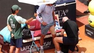
 12 May 2026 | 07:00Sinner: "I have nothing to lose in Rome, I can play relaxed"
 -
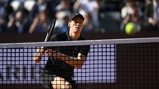
 12 May 2026 | 21:00I've already seen this Zverev movie
 -
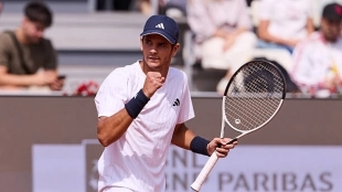
 12 May 2026 | 20:00From Miami to Rome: Landaluce reaches the quarterfinals of a Masters 1000 again
 -
 13 May 2026 | 11:00Alcaraz: "I get overwhelmed if I think I have 15 years of career left"
 -
 12 May 2026 | 16:00The more mature Jódar reappears: "I take this whole year as a year of learning"
 -
 12 May 2026 | 13:00The monster from Leganés is on the loose in Rome
 -
 12 May 2026 | 16:00Schedule and where to watch the Jódar vs Darderi match at the ATP Rome 2026
 -
 12 May 2026 | 17:00Sinner praises Jódar again after his victory at the ATP Rome
 -
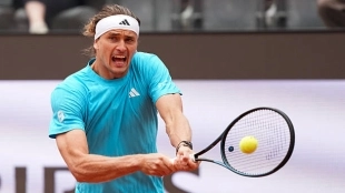 12 May 2026 | 17:00Zverev's latest excuse: "It's the worst court I've played on"